Analyzing Refugee Migration Networks with Neo4j
View the full project on GitHub
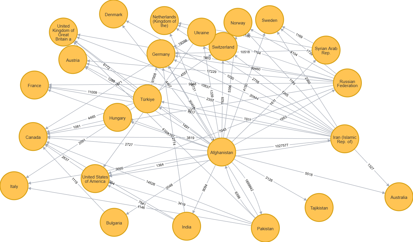
The above graph displays every country receiving \(\geq 1000\) Afghan refugees in 2010. A nice picture, but lacks structural insights.
Can we quantify Afghanistan’s influence on global migration networks? Which nations act as intermediate transit points? Modeling refugee flow as a graph allows us to run various algorithms to answer these questions and understand how geopolitical crises reshape refugee networks.
Short Description
In this project, I analyzed refugee data from 2010-2024 using Neo4j and graph algorithms such as PageRank and Betweenness Centrality.
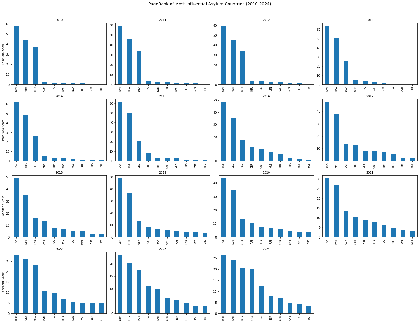
I modeled refugee migration as a directed network: countries as nodes, refugee flows as weighted edges. Below is one of the results from running PageRank to determine influential asylum countries. Note that PageRank score takes into account raw refugee numbers and which countries the refugees come from.
Explore the full methodology, visualization, and analysis on GitHub.